Find your way around
Every product shares one layout. The icon rail, the section panel, jump-to with Ctrl+K, Admin at the bottom of the rail, and how it works on a phone.
Online version, always current: https://cloudvision360.com/docs/platform/navigation/
CloudVision360, ITOps360, AgentVision360, BackupVision360 and the portal share one layout, so once you know one product you know them all. Anything is at most two clicks away: a hub in the rail, then a page in the panel.
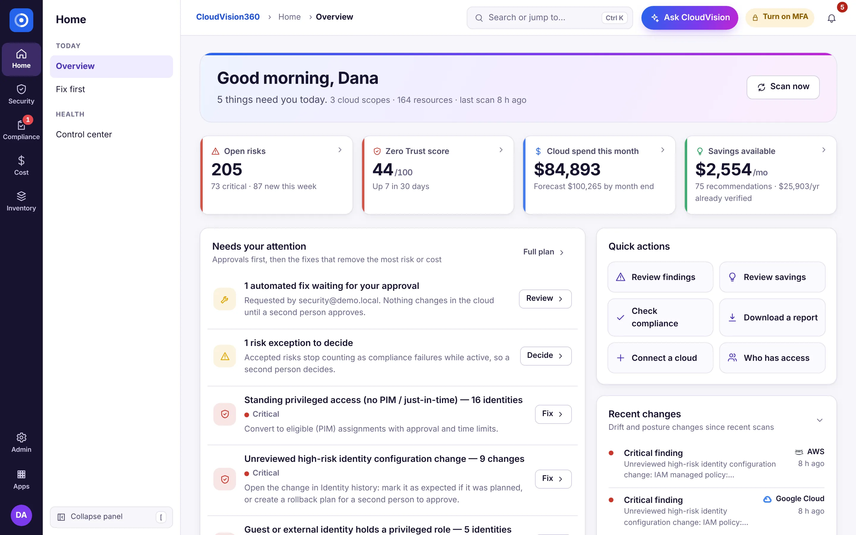
The icon rail
The dark rail on the far left holds:
- The product logo: back to the product’s Home.
- One icon per hub, with a short label under it. A red badge counts what needs you (approvals, alerts, failed backups). You only see hubs that have something you’re allowed to open.
- Admin (the gear) at the bottom: settings, people, audit, connections and customers, for the people who have them.
- All apps: switch to My Apps in the portal or to another product you use.
- Your avatar: your account, light, dark or automatic theme, help, sign-out, and in ITOps360 the Employee view.
| Product | Hubs |
|---|---|
| CloudVision360 | Home · Security · Compliance · Cost · Inventory |
| ITOps360 | Home · Service desk · Devices · Infrastructure · People · Insights |
| AgentVision360 | Home · Spend · Governance · Safety · Evidence |
| BackupVision360 | Home · Protect · Restore · Storage · Reports |
| Portal | My Apps · Dashboards · People · Vision · AI tools · Account (and Customers or Provider access for service providers) |
The section panel
Next to the rail, the section panel lists the hub’s pages under small headings, for example Security: Detect (Findings, Secrets & certificates), Identity (Identity, Identity history, AI agents) and Emergency (Break-glass). Counts show as pills; a red pill means someone is waiting for you. Your saved views of the hub’s lists sit at the bottom of the panel (see CloudVision360 and ITOps360). A hub with a single page, such as Home in ITOps360, shows no panel.
Need more room for a wide table? Choose Collapse panel at the bottom of the panel, or press [. The rail stays; hovering or focusing a hub opens its pages as a flyout. Press [ again to bring the panel back. Your choice is remembered in this browser.
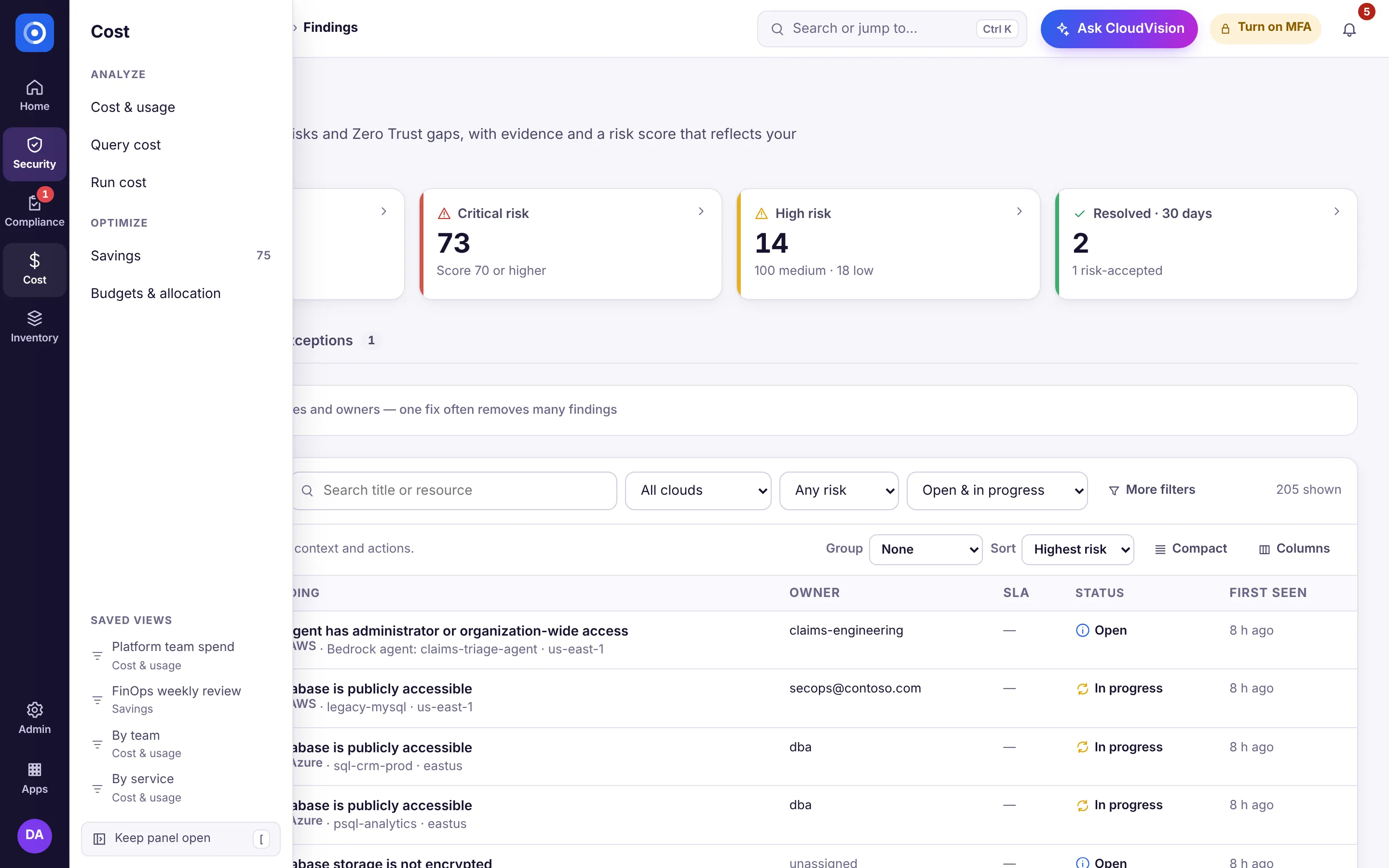
The top bar
Above the page: the breadcrumb (product, hub, page), jump-to, the assistant (Ask CloudVision, or the name your organization gave it) and notifications. When a service provider works in a customer’s organization, a colored strip under the top bar says so.
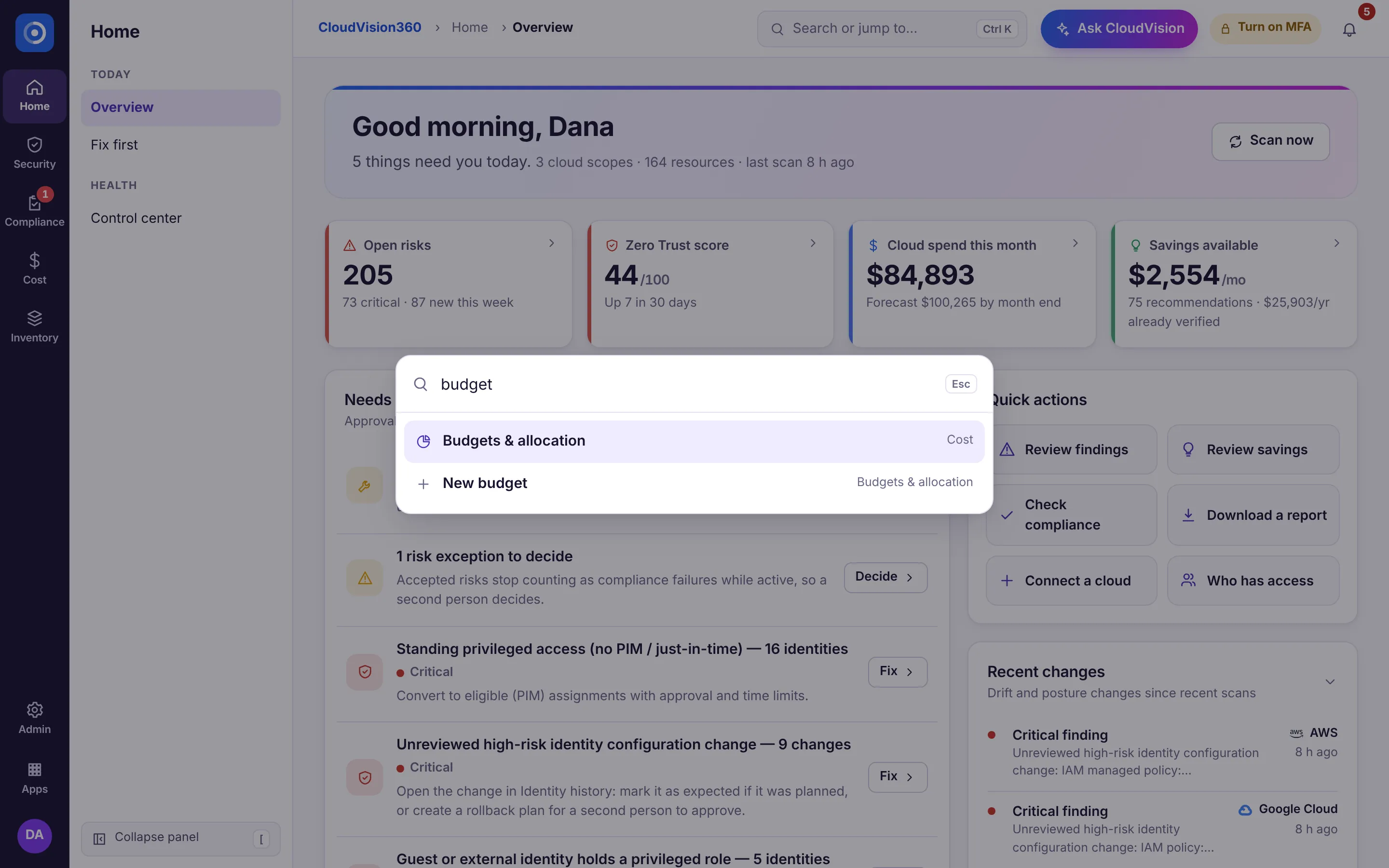
Jump to anything
Press Ctrl+K (⌘+K on a Mac) or click the search box in the top bar, and type a few letters: a page (“savings”), a task (“new budget”, “invite a user”, “connect a cloud”) or a setting (“single sign-on”). You only see pages and actions you’re allowed to open. Use the arrow keys and Enter.
On a phone
Below 1,024 px wide, the rail and the panel become one slide-out menu, opened from the menu button in the top bar; search and the assistant stay in the top bar as icons. Every page works at phone width without sideways scrolling.
Links keep working
Every page kept its address when the layout changed, so bookmarks and links from e-mails, notifications and Vision Agent still open the right page.